police-shootings-analysis
Police Shootings Analysis
A study of the public record of people killed by police in the United States, set beside US Census figures on poverty, schooling, income, and race by city. It turns 2,535 death records into 24 charts, plus a web page where you can narrow the figures to one state, year, or type of case. California recorded the most cases; about a quarter of the records noted signs of mental illness.
Solo work by Salman Adnan.
Overview
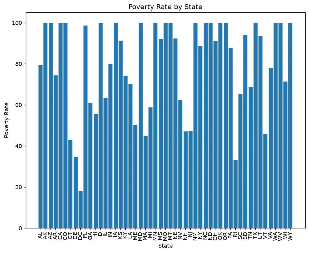
A data analysis of the Washington Post's dataset of fatal police shootings in the United States, cross-referenced against four US Census datasets (poverty rate, high school completion rate, median household income, and racial demographics by city) to look for socioeconomic patterns. It ships two ways to look at the results: a static script that writes 24 chart files, and an interactive Flask dashboard filterable by state, year, and armed status.
Key features
- Loads and cleans 5 CSVs (about 2,500 rows of fatality data plus city-level Census data covering roughly 29,000 to 33,000 rows each), coercing string percentages and ages to numeric with bad values turned to
NaNinstead of crashing. - Joins the poverty and high-school-completion datasets on city for a combined regression plot, and renders the same comparison chart in matplotlib, seaborn, and plotly.express as a side-by-side API reference.
- Builds a US state choropleth of total killings from raw state abbreviations and runs entirely headless, writing every chart to
output/as a file. - An interactive Flask dashboard with three dropdown filters (state, year, armed status) built from the real values in the data, plus a clickable choropleth where clicking a state sets the filter directly.
- A stat row (filtered record count, percent with signs of mental illness, most-affected state, most common armed status) that recomputes from the exact same filtered rows the charts show, so it can never drift from what's on screen.
Verification
A verified run of analyse_deaths.py confirms 2,535 total fatality records: 2,428 male and 107 female, 633 rows (about 25 percent) recorded signs of mental illness, and the top armed categories are gun (1,398), knife (373), vehicle (177), unarmed (171), and undetermined (117). The five states with the most recorded killings are California (424), Texas (225), Florida (154), Arizona (118), and Ohio (79). The repo ships a curated output/ folder with 18 static PNGs from that run.